Continuing on with the theme of posting lessons from my Conservation Biology class this January, another lesson that turned out to be really effective in Week 1 was centered on reading and presenting data. One of my learning goals for the course was for the students to be able to collect original data, analyze it visually (no statistics, just examining trends), and then present it both orally and in written form. This is a big task in any class – let alone one that only spans four weeks – but the students rose to the challenge admirably.
In order to get them ready for collecting and interpreting their own data, however, we worked through a few of the foundations all together.
First, we talked about data – what it is, how it’s collected, and how we classify different kinds of data. For teachers, here’s a link to a PDF of my slides. You’re welcome to mine them for anything useful!

For our purposes, we focused on three data types (continuous, categorical, and ordinal) and four primary data visualization tools (bar charts, scatter plots, line charts, and box and whisker plots). See the linked PDF above for working definitions of each!
Overall, I tried to impress this paradigm upon them: For any data visualization, the first step is to identify a clear and well-circumscribed question. You then need to amass relevant data and understand any shortcomings of the dataset. The next step is to analyze and visualize the data appropriately, according to the data characteristics. The final step, and this is important because science can’t happen in a vacuum, is to communicate those results.
So, we tried it!
I’ve been working on lizards in Greece for the last eight years and in that time I’ve caught, measured, raced, flushed, poked, and prodded thousands of lizards (I keep meaning to actually tally them all up… another day, another post). I gave students a bit of background on the lizards and then set them loose in five teams of four to one of each of the whiteboards in the classroom (I was super lucky to have a massive classroom with lots of space for spreading out – another post on that too!). Each team was then asked to write three questions and draw three graphs using these data (PDF here): 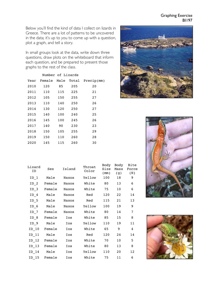 Alright, truth be told, these measurements weren’t actually from lizards in the field, but all of them are the types of data I do collect. I had to put my finger on the scale, so to speak, so I could be sure there were a few patterns in there for the students to discover. And discover them they did!
After 10 minutes or so, when all five teams had finished their graphs, I then created four new teams of five with one representative from each whiteboard (I feel like I need to make a diagram just to explain the choreography of this class!). Those four teams then rotated from whiteboard to whiteboard ever three or four minutes and the representative of that team was tasked with explaining the questions, data visualization choices, and insights gained from the analysis.
It was a lot of herding people from place to place but at the end of the day, everyone in the class had a hand in coming up with questions, drawing graphs, and communicating their findings to their peers. I was immensely impressed.

Excellent, you are a great teacher, This is a remarkable illustration story telling with data.